When it comes to home design, color is one of the most powerful tools at your disposal. Beyond simply setting a visual tone, colors can significantly impact your mood, productivity, and overall sense of well-being. Understanding color psychology can help you choose hues that not only beautify your space but also contribute positively to your emotional and psychological health. In this blog post, we’ll explore the principles of color psychology and offer practical tips on how to incorporate colors into your home to enhance different aspects of your life.
Understanding Color Psychology
Color psychology is the study of how colors affect our emotions and behaviors. Different hues can evoke various responses, from calming effects to energizing boosts. This field combines insights from art, design, and psychology to help us understand why certain colors make us feel a certain way. When applied thoughtfully in home design, these principles can create environments that support your personal and functional needs.
1. Calming Blues and Greens
Blue and green are often associated with calmness and tranquility. Blue hues, reminiscent of the sky and ocean, have been shown to lower heart rates and reduce stress. This makes blue an excellent choice for spaces dedicated to relaxation, such as bedrooms and bathrooms. Soft, pastel blues can create a serene environment, while deeper navy shades can offer a touch of sophistication without overwhelming the senses.
Similarly, green, which evokes the feeling of being surrounded by nature, promotes a sense of balance and renewal. Light greens and sage tones can be refreshing and help reduce anxiety, making them ideal for home offices or areas where you need to focus and recharge. Adding indoor plants can enhance these effects, bringing both aesthetic appeal and natural calmness.
2. Energizing Yellows and Oranges
Yellow and orange are known for their energizing and uplifting properties. Yellow, often associated with sunshine and optimism, can stimulate mental activity and enhance mood. It’s perfect for spaces where you want to foster creativity and enthusiasm, such as kitchens or creative workspaces. However, because bright yellow can be overwhelming in large quantities, consider using it as an accent color or in smaller doses to avoid overstimulation.
Orange shares similar qualities but is often considered warmer and more inviting. It encourages social interaction and can be great for dining rooms or living areas where you want to create a lively and friendly atmosphere. Warm oranges, such as pumpkin or terracotta, can add a cozy and vibrant touch to your home.
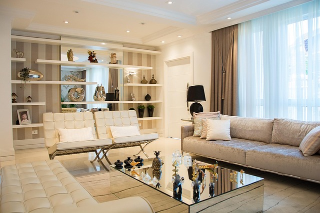
3. Sophisticated Neutrals and Earth Tones
Neutral colors like beige, gray, and taupe offer versatility and a calming backdrop that can make other colors pop. These tones are known for their ability to create a sense of balance and stability. Gray, in particular, is often used in contemporary design for its sleek and sophisticated look. Depending on the shade, gray can range from calming to invigorating, making it a flexible choice for various rooms.
Earth tones such as browns, rusts, and ochres bring warmth and grounding to a space. These colors are reminiscent of nature and can create a cozy, welcoming environment. Earth tones work well in living rooms and bedrooms, where comfort and relaxation are key. They can also help to connect your indoor spaces with the outdoors, fostering a sense of harmony.
4. Romantic Pinks and Lavenders
Pink and lavender are often linked with romance and tranquility. Soft pinks can evoke a sense of nurturing and calmness, making them ideal for bedrooms or areas intended for relaxation and intimate conversations. Pinks can range from delicate blush to more vibrant fuchsias, so you can adjust the intensity based on your desired mood.
Lavender, with its gentle blend of purple and blue, promotes relaxation and can help reduce stress. It’s a wonderful choice for spaces where you want to unwind, such as bedrooms or reading nooks. Lavender’s soothing quality makes it an excellent option for creating a serene retreat from the hustle and bustle of daily life.
5. Dynamic Reds and Purples
Red is often associated with passion, excitement, and energy. It can stimulate appetite and conversation, making it a popular choice for dining areas or social spaces. However, red is a very intense color, and using it too liberally can lead to feelings of agitation. Consider incorporating red through accessories or accent walls to provide a burst of energy without overwhelming the room.
Purple combines the stability of blue with the energy of red, creating a color that is both regal and calming. Lighter purples like lilac are soothing and can be used in bedrooms or bathrooms for a touch of elegance and tranquility. Deeper purples, such as aubergine or plum, can add a sense of luxury and sophistication to living areas or home offices.
Practical Tips for Using Color in Your Home
- Start Small: If you’re unsure about how a color will impact your space, start with smaller items like throw pillows, rugs, or artwork. This allows you to experiment without committing to a full room overhaul.
- Consider Lighting: Natural and artificial lighting can affect how colors appear. Always test paint samples in different lighting conditions to see how they change throughout the day.
- Use the 60-30-10 Rule: This classic design rule suggests using a primary color for 60% of the room, a secondary color for 30%, and an accent color for 10%. This approach helps create a balanced and visually appealing space.
Personal Preferences: Ultimately, the best colors for your home are those that you enjoy and feel comfortable with. Don’t be afraid to personalize your space with hues that resonate with you, even if they deviate from traditional color psychology principles.
Featured Image Source: https://cdn.pixabay.com/photo/2016/08/26/15/06/home-1622401_640.jpg